
How to Hang a Balanced Poster Wall That Feels Effortless and Collected
There’s something so rewarding about curating a wall that tells a story — a collection of art, music, and memories that come together in one perfectly balanced display. Poster walls, or gallery-style art arrangements, are one of my favorite ways to make a space feel personalized and creative. They instantly bring warmth, color, and a sense of identity to a room.
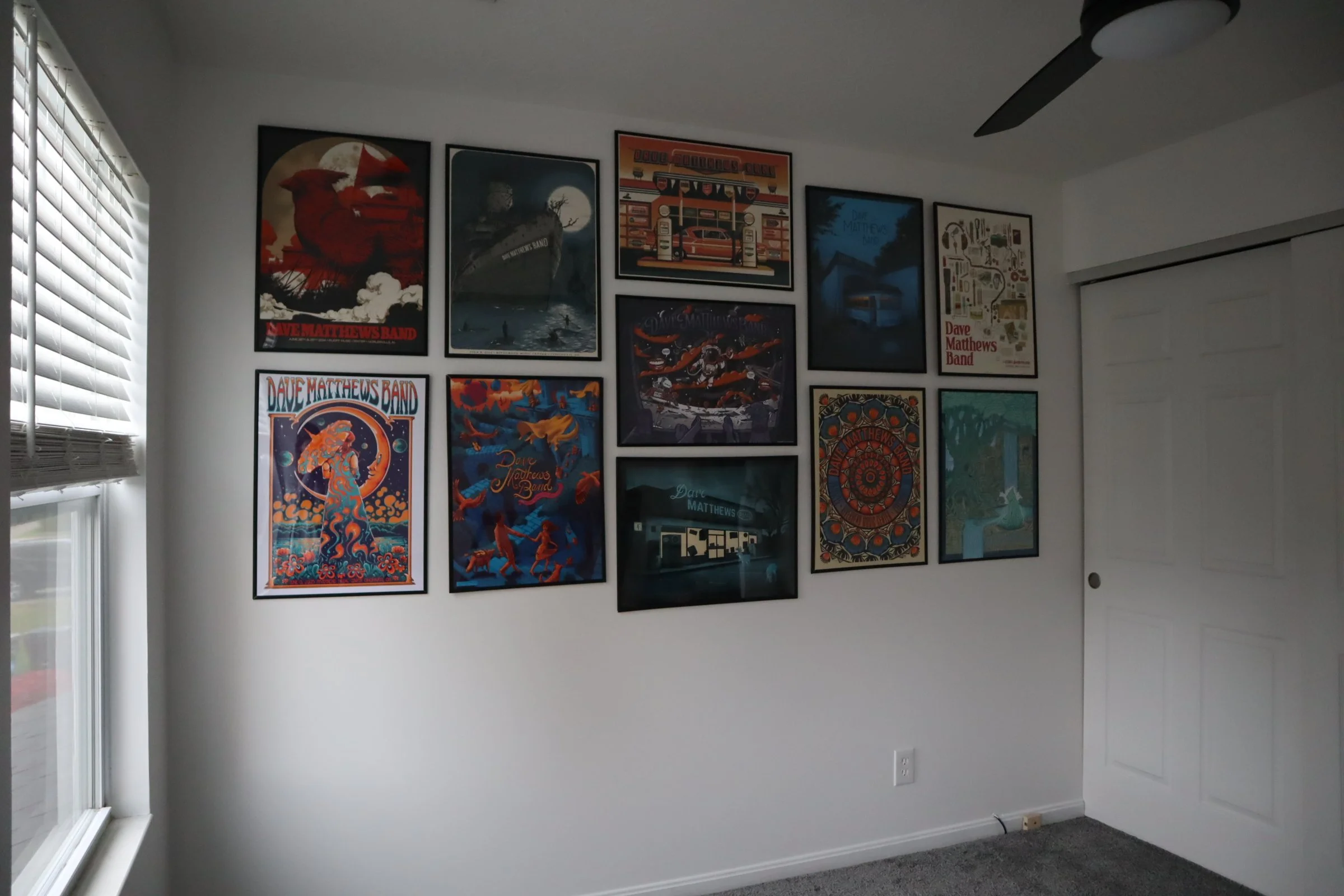
This wall, in particular, is a special one for us. My husband has been a huge Dave Matthews Band fan for years, and he’s been collecting their concert posters since 2014. Each one has its own memory and meaning — places he’s been, shows he’s seen, and songs that hold a story. We finally decided it was time to give his collection the display it deserves.
When I started planning this wall, I wanted it to feel cohesive and intentional — not just a random assortment of prints. The goal was to create a design that showcased each poster’s personality while feeling harmonious as a whole. The trick? Balancing colors, distributing visual weight, and arranging everything so it feels natural and grounded.
Here’s exactly how I planned and hung our Dave Matthews Band poster wall, step by step — no tape templates required!
Step 1: Start by Laying Everything Out
Before putting a single hole in the wall, I laid all of the posters out on the floor. This is the best way to experiment with arrangements before committing. It’s like designing a puzzle — finding the right rhythm between sizes, colors, and compositions until it feels right.
Here’s what I focused on while arranging:
1. Balance the Colors
Because these are all from the same artist and band, there are lots of repeating tones and styles. Some are bright and bold; others are darker and more moody. To keep the wall from feeling too heavy on one side, I spread those deeper tones evenly throughout.
Think of color like weight: darker, bolder colors naturally draw the eye more than light ones. When you distribute them evenly, the wall feels balanced and harmonious.
2. Distribute Visual Weight
Another important aspect is visual weight — how big or attention-grabbing each piece feels. I placed larger or darker posters toward the center, then worked outward with lighter or smaller ones. This creates a natural focal point that anchors the entire display.
Even though every poster is different, this trick makes the whole wall feel unified and intentional.
3. Mix Up Orientations
We had both vertical and horizontal frames, which actually made the layout more dynamic. Alternating orientations helps break up repetition and keeps your eye moving across the wall.
Step 2: Choose Your Layout Style
Once everything was laid out, I stepped back to look at the overall shape. You can approach a poster wall two main ways:
The Grid Layout
Clean, structured, and symmetrical. This style works best when your frames are all the same size and you want a neat, polished look.
The Organic Cluster
This approach is a bit more relaxed — a mix of different sizes and orientations arranged so they feel collected rather than perfectly measured. The key is to keep the outer edges roughly rectangular or oval so it still reads as one cohesive display.
For this project, I chose an organic cluster layout. Since these posters vary in size and design, it gave me the flexibility to play with spacing while still keeping the whole wall visually balanced.
Step 3: Find the Right Height
One of the most common mistakes when hanging art is placing it too high. For gallery-style arrangements, the general rule of thumb is to keep the center of the wall about 57–60 inches from the floor, which is roughly eye level.
If your poster wall hangs above a piece of furniture, like a sofa or console, leave 6–8 inches of space between the top of the furniture and the bottom of your lowest frame. That small gap helps the wall feel connected to the furniture below rather than floating awkwardly above it.
Keeping your arrangement centered and close to eye level gives it that museum-quality balance — comfortable to look at and easy on the eyes.
Step 4: Skip the Tape
Normally, I use painter’s tape or paper templates to map out frames on the wall before hanging. It’s a great method when you’re still figuring out spacing or the layout feels tricky.
But for this wall, I didn’t need to. Once everything was laid out on the floor, I had a clear vision of how it should come together. These frames were easy to work with and simple to measure, so I skipped the tape altogether and measured as I went.
If you have a good eye for balance and already love your layout on the floor, you can absolutely skip this step too. It keeps the process more organic and saves a lot of time.
Step 5: Measure for Even Spacing
The most important measurement when creating a cohesive gallery wall is the space between each frame.
I like to keep 2–3 inches between each one — close enough to make the collection feel unified but open enough that each print has a bit of breathing room.
If you’re going for a symmetrical look, you’ll want to measure carefully to ensure those gaps are consistent both vertically and horizontally. For an organic layout, it’s more about what looks even to the eye than perfect precision — as long as the spacing feels balanced when you step back, you’re on the right track.
Step 6: Start from the Center
When hanging multiple pieces, always start with your centerpiece — the anchor of the collection — and build outward.
For us, the centerpiece was one of the larger, moodier Dave Matthews Band prints, which naturally drew the eye. I placed it right in the middle of the wall and built the rest of the arrangement around it, alternating color tones and frame sizes as I went.
Starting from the middle helps you stay symmetrical and makes it easier to adjust spacing as you work your way out.
Step 7: Use Glue Dots to Keep Frames Straight
Here’s one of my favorite little hanging tricks: clear glue dots.
Some frames only have a single hook on the back, which makes them more prone to shifting or tilting over time. To keep them perfectly level, I place a small glue dot on each bottom corner before pressing the frame gently against the wall.
It’s such a simple fix, but it makes a huge difference. The frames stay straight, stable, and snug against the wall — no constant readjusting needed. Plus, they don’t damage the paint and can be easily removed later if you need to reposition something.
Step 8: Step Back and Adjust
Once everything is up, take a few steps back and look at the entire wall. Sometimes a frame that looked right up close will feel a little off when you see it from across the room.
Look for:
Even spacing
Balanced color distribution
Straight lines
A natural “flow” between pieces
Make small adjustments where needed — even a shift of half an inch can make a big difference in the overall feel.
Final Thoughts: Let Your Wall Tell a Story
When it comes to gallery walls, perfection isn’t the goal — balance and meaning are.
This wall is more than just decoration. For us, it’s a story of music, moments, and memories — each poster marking a concert, a city, or a year that holds significance. It’s a conversation starter, a design feature, and a little glimpse into my husband’s love for Dave Matthews Band, beautifully woven into our home.
If you’re planning your own poster or gallery wall, remember to start with what you love. Arrange it in a way that feels natural to you. Trust your eye, keep the spacing consistent, and don’t stress over perfect symmetry.
The best walls are the ones that feel lived in — curated over time, with each piece adding another layer to your story.
By Leah Ann Grace